Fonts – Heart Beat of Website Designs

There was a time when everything was simple in its 8 bits way. The text we see on the screen was simple in one style and was readable and understandable to everyone in the world at the same time. Then VGA happened and things got condensed to 64, 128, 256 and 512 bits. The way it happened it also opened a lot of doors for the graphics on the screen.

“Abstract artists cheat. They create aesthetically beautiful art and ask you to interpret it for yourself. They can pool all their efforts into making their art beautiful because they don’t need to worry so much about communicating a message (since the message is almost always subjective).” – Lynn Sharafeddine

The point where it affected the most, among many other things was the fonts. These structural representations of Alphabets and Numerals are a common use amongst the average computer users. Since the dawn of its existence the computer has been used for the data processing, that data is represented in form on codes (at first) then it started to represent spoken languages and numerals, a much easier way a human could understand that.

In the midst of all this, things have dramatically tainted for their better, to more revolutionary innovative facets. Fonts are now considered as the heart beat of website designs. They not only represent the textual formats on a design, they are used for far more creative purposes. Such as;

  • Representing a marketing slogan
  • Tone of the message
  • Representing a company
  • Communication medium
  • Creating psychological and cognitive senses in users

They way designers are using fonts, is easily comparable to the masterpieces in arts and architectures created generations ago by artists and sculptress.

For websites the challenge is to have good fonts, but good fonts that are also readable and less confusable for the users. Because the ultimate goal of the having a website, is having a representation of yourself, which most of the visitors should like.

So the font selection in this case is very vital. Here are some good advices:
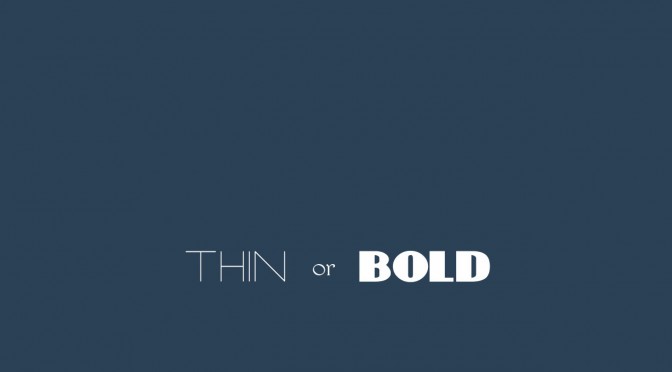
The Font Hierarchy:

It’s the way you divide your text from the most important to the least important. The designer creates a hierarchy of textual messages across the design board. The use of font size and color helps create this hierarchy to the readable form, i.e. Effective readable form!

The large size with bright color, to the smaller size and dimmer color contrast makes the user comes down the flow of messages across the screen. Everything large = bad and everything small = bad!

Use of Different Font Types:

I think Google is the best example here, telling us how the use of different font types in a collective form effectively delivers a more user oriented message across the world to a billion users at a time!

swaam_tech

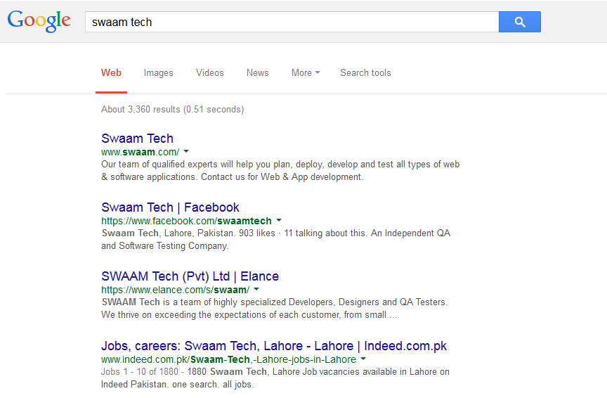
Searching for “Swaam Tech” comes with a lot of results on Google. The font sizes and coloring makes it easier for the user to decide what to do. I can access Swaam’s website, then their Facebook page, what they are doing at Elance and then Careers. Similarly the coloring in the links differentiate between the textual explanation of what the link represent to the link itself in a different color, font and size.

It creates a cleaner look to the website and makes the user feel more confident at the other end, whereas if you talk about quality perspective, then it creates a reliable and usable application for the team.

Empowering Consistent Design:

Fonts and their managed hierarchy provide consistent website design. Consider your landing page with a certain standard hierarchy of fonts ranging from main, to sub and sub-sub headings and texts. Then inheriting the same hierarchy to the rest of the pages and sub-pages of the website, and making it as a standard. This way the user feels comfortable and consistent in actions, as they know where they are and what these texts and messages means, no matter which area they are focusing on.

Use a Combo of Fonts:

Combine the fonts with style and unique orientation with standard fonts across your website design. This creates a consistent and witty sort of look to the website. This cooks up a clever yet very warm and welcoming effect for the users, which includes the text, and the font that goes with it.

Check this out for example:

About_Us_OuttaBox_-_2015-07-30_12.00.05

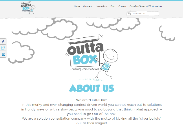
A wild and bold font, with a more delicate selection of text and then something else on the menu, creating the user feel more relaxed and focused on the message rather going in for the details.

Conclusions:

Have your designer and developer on board for the consistency in your web designs. Have them get the fonts and styles ready as pooled resources from Heading 1 to 6, text, messages, links, menus, and slogan texts.

This way the application of fonts becomes easier and manageable across pages.

The keyword here is the standard that user and developer seek, and on both ends, it creates comfort and reliability, which is good for your products and designs.

Idea, Design, Code, and Action!

You want to establish a long term business, a good clientele and a product that is acceptable to your customers? Yes, everyone does.

Since now things have started to move very rapidly we tend to confuse ourselves in the complexities of how to sell and earn more money, where in my opinion “money” is a bi product, which we don’t keep in our focus.

“Though many preach, “It doesn’t matter. Don’t question it, don’t cause a wake”, I always strive to make things better – I have a difference to make! … – Vadim Kotelnikov

So what do we keep in focus? Someone answers that long time ago. Dr. Deming provided a continuous improvement cycle which proved to be the key to success for many small and large businesses – and still do. However due to the labeling of the practice under some standard, we are now taking this as granted.

I will here show you what that was, and how we can improvise this to the new business setups – so that they can earn big!

Deming’s cycle was based on 4 elements; Plan, Do, Check, and Act, with an advanced version of the image showing Customer on both input and output end of the diagram. The reason for this is to keep the focus on the customer’s inputs regarding the requirements, whether implicit or explicit and the feedback after the use of the products.

The reason I discussed this cycle here is the hard core fact that PDCA is still the building block for quality cultures in the organizations. Since now, we are entering a new era of Start-ups and young entrepreneurs with a vast variety of products and ideas – the establishment of this model becomes a necessity. Only thing is, that we need to consider it with a different perspective, which can serve the new born businesses in a better way, without effecting the real essence of Plan, do, check and act cycle.

The base unit for startups to get things going is the idea they come up with. The realization of this idea leads to selection of technology, the office space, the investments, and the customers. If you have a good idea that can sell and flourish itself within the next few months (and this should be quick) then you have something which can grow as a business.

The reason we use plan, do, check and act as a standard cycle, that it is easily understandable and adaptable, and to make it more interesting, we shall replace the PDCA with Idea, Design, Code, and Action.

Conceiving the Idea:

For startups to get things going, first of all you need the Idea. Without the idea, you cannot move forward. There is a whole science and management involved in getting the right idea, and the one which actually kicks in some big bucks.

So to play safe usually what the crowd does is, to work upon something which pre-existed. This way they only have to look for the right market segment. For example, going with On-Line Fashion sales, or Food Deliver business.

For the wild side, the idea comes with a lot of risk, because what you are aiming at is something never been tried before. This is where the stakes are too high but the payoff is sky rocketed.
In any case, without the “right” idea, the wheel cannot move.

Designing:

It is okay to think beyond limits and aim for the sky. It is okay to go wild and out of the box. It is okay to see what others fail to see and put your perspective in first place. But, it is not okay to just keep this in your mind, and not let it drawn out on the board.

Designing does that to the idea. It creates it into a feasible form which one can see and then realize about its practical implications. There are a lot of concerns which are taken under considerations, such as the frameworks, how much would it cost, who will use it, the size of the product, platform, market segment, portability, security, reliability, and adaptability.

When Peter Jackson talked about remaking King Kong, he immediately created the initial design of the climax scene – which actually helped creating the complete film framework.
It is simply that important!

Code the Design:

It is not necessary that you have a software product as your prime idea. It could be a service or a physical product which you are creating the design for. But in any case the “Coding” means that you need to formulate that design into a practical form. Into something which has working components, integrated, and functioning.

In any case you need to construct the design into workable form.

The best way to approach this is to code the product, test it, pass it or fail it and then redo. This is where in PDCA, the “Check” part comes in. It is where the conceived process is actually checked for its performance before being delivered to the customer (stake holder)

Most of the startups run a beta version of their product for the select customers. With this the quick errors, issues, functionality, performance and bugs which are overlooked by the team are revealed. Also, this is where the “user experience” reveals itself and provides major changes in the design phase.

Take an Action:

You need to consider this carefully while conceiving the idea that ultimate game is to send the product to the customer, and then earn on it. To do this, we take actions. Actions are:

  • Delivery
  • Feedback
  • Improvements regarding the feedback
  • Redo the delivery

This cycle is like a continuously moving wheel, which takes in the feedbacks from internal and external stake holders, with the focus on Improvements to the system.

Conclusion:

What we have tried to establish here is the fact that quality and continuous improvement are not some things, which we can take for granted. We cannot launch a product or business without considering its design, customers and the feedbacks it is going to provide.

“Listening to customers must become everyone’s business. With most competitors moving ever faster, the race will go to those who listen (and respond) most intently.” – Tom Peters