There was a time when everything was simple in its 8 bits way. The text we see on the screen was simple in one style and was readable and understandable to everyone in the world at the same time. Then VGA happened and things got condensed to 64, 128, 256 and 512 bits. The way it happened it also opened a lot of doors for the graphics on the screen.
“Abstract artists cheat. They create aesthetically beautiful art and ask you to interpret it for yourself. They can pool all their efforts into making their art beautiful because they don’t need to worry so much about communicating a message (since the message is almost always subjective).” – Lynn Sharafeddine
The point where it affected the most, among many other things was the fonts. These structural representations of Alphabets and Numerals are a common use amongst the average computer users. Since the dawn of its existence the computer has been used for the data processing, that data is represented in form on codes (at first) then it started to represent spoken languages and numerals, a much easier way a human could understand that.
In the midst of all this, things have dramatically tainted for their better, to more revolutionary innovative facets. Fonts are now considered as the heart beat of website designs. They not only represent the textual formats on a design, they are used for far more creative purposes. Such as;
- Representing a marketing slogan
- Tone of the message
- Representing a company
- Communication medium
- Creating psychological and cognitive senses in users
They way designers are using fonts, is easily comparable to the masterpieces in arts and architectures created generations ago by artists and sculptress.
For websites the challenge is to have good fonts, but good fonts that are also readable and less confusable for the users. Because the ultimate goal of the having a website, is having a representation of yourself, which most of the visitors should like.
So the font selection in this case is very vital. Here are some good advices:
The Font Hierarchy:
It’s the way you divide your text from the most important to the least important. The designer creates a hierarchy of textual messages across the design board. The use of font size and color helps create this hierarchy to the readable form, i.e. Effective readable form!
The large size with bright color, to the smaller size and dimmer color contrast makes the user comes down the flow of messages across the screen. Everything large = bad and everything small = bad!
Use of Different Font Types:
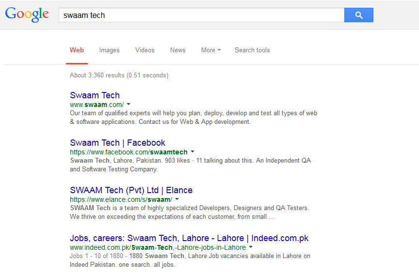
I think Google is the best example here, telling us how the use of different font types in a collective form effectively delivers a more user oriented message across the world to a billion users at a time!

Searching for “Swaam Tech” comes with a lot of results on Google. The font sizes and coloring makes it easier for the user to decide what to do. I can access Swaam’s website, then their Facebook page, what they are doing at Elance and then Careers. Similarly the coloring in the links differentiate between the textual explanation of what the link represent to the link itself in a different color, font and size.
It creates a cleaner look to the website and makes the user feel more confident at the other end, whereas if you talk about quality perspective, then it creates a reliable and usable application for the team.
Empowering Consistent Design:
Fonts and their managed hierarchy provide consistent website design. Consider your landing page with a certain standard hierarchy of fonts ranging from main, to sub and sub-sub headings and texts. Then inheriting the same hierarchy to the rest of the pages and sub-pages of the website, and making it as a standard. This way the user feels comfortable and consistent in actions, as they know where they are and what these texts and messages means, no matter which area they are focusing on.
Use a Combo of Fonts:
Combine the fonts with style and unique orientation with standard fonts across your website design. This creates a consistent and witty sort of look to the website. This cooks up a clever yet very warm and welcoming effect for the users, which includes the text, and the font that goes with it.
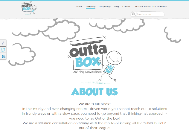
Check this out for example:

A wild and bold font, with a more delicate selection of text and then something else on the menu, creating the user feel more relaxed and focused on the message rather going in for the details.
Conclusions:
Have your designer and developer on board for the consistency in your web designs. Have them get the fonts and styles ready as pooled resources from Heading 1 to 6, text, messages, links, menus, and slogan texts.
This way the application of fonts becomes easier and manageable across pages.
The keyword here is the standard that user and developer seek, and on both ends, it creates comfort and reliability, which is good for your products and designs.